New
#1
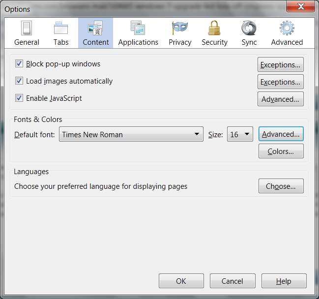
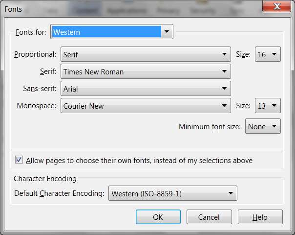
Windows 7 upgrade led to loss off crispness & quality in browser text
Well, I decided to update my HP laptop from Windows Vista Home Premium to Windows 7 Ultimate (both 64 bit) and in doing so my firefox and IE browsers are considerably harder to read. Twitter, Facebook, Youtube descriptions, most anything has very poor quality.
I recently came across this problem on my desktop after updating my graphics card's driver via an optional windows update (big mistake) and all I had to do was rollback the driver. For this problem, I tried updating the graphics card's driver, but it's up to date.
I hope there's an easy fix for this, I really don't know what to do. Any ideas?

 Quote
Quote