New
#1171
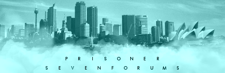
I like the colors for the background. 8/10.
Made something simple, as I was getting annoyed at my shrinked down Tyler Durden sig. I find some strange attraction to this new one.
I like the colors for the background. 8/10.
Made something simple, as I was getting annoyed at my shrinked down Tyler Durden sig. I find some strange attraction to this new one.
I was thinking of colors, but it seemed so nice monotone.
If anything, I'll be going for a much lighter blue.
Also, 9/10.
9/10
Very nice shades of blue and stylish glassy lookThe "Boogie" might be a bit difficult to read because the letters are so intricate, but otherwise, cool font.

 Quote
Quote