New
#1
Suggestions for this great forum ...
Hi, I was surprised to have found forums which are specialized on Windows 7 already.
Have compared a few about their look & feel as well as their competence.
Sevenforums has won for me.
Can I make a suggestion which is entirely constructive and not meant to be trouble ?
I use a 24 inch screen for little over a year now and the space available is mindblowing compared to my old 17 inch one.
When using Internet Explorer, I noticed that some websites still don't adjust to those having bigger screens.
Their sites are like designed for small to tiny screens.
I understand that the website designers try to enable all users to be compatible, but it does look outdated when a little window opens, the size of three fingers, in which you need to scroll in order to see more content, while your space available would be more like 9 hands instead of three fingers.
That is not so bad as other forums are much worse in that respect.
Another suggestion regarding your color scheme is more dear to me:
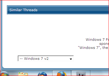
In the picture under A) you have chosen a color very pleasing to the eye.
Not only is blue my favourite color, but it also matches the good all around design.
Only thing which is annoying me amazingly is that white field under B).
It blindes.
White makes a clean and decent impression, but using a forum for many hours or internet in general, makes my eyes slowly tired.
It has become so significant that it's affecting me in how often I use this forum now.
An extreme example of what is very relaxing to the eye is [H]ard|Forum - Powered by vBulletin where I don't wanna say dark colors are the only way, but going for pastel or any different color than blinding white would be such a big improvement "in my eyes".
Who could make a desicion on sevenforums in this case ?
I would suggest to try a pastel color instead of white, for only a few weeks and see how the feedback is.
What do you think ?

 Quote
Quote