New
#1
Rainmeter skin concepts
Hi, I'm currently working on some concepts and wonder whether you can help me.
To make it clear, I'm very keen in creating designs but I'm not able to program that.
After having read through the avalanche of information of how to modify skins, I don't see myself being able to learn developing a skin by myself anytime soon. It will take a long time for me to learn only the basics. Because I'm a litte impatient, I have decided to just show you my concepts in progress and see what you think.
Please do make any suggestions you may have to improve the design(s) and if anyone is even willing to help doing the hard stuff (encoding), that'd be absolutely awesome. I like my skins to be clean, neat and complete. Although there is a massive amount of different skins existing, I have not found the skin of my dreams yet. That's why I thought it would be ever so cool, to get it tailored to my very personal taste.
Do you think it's possible to get either of these concepts of skins put into actually working order?
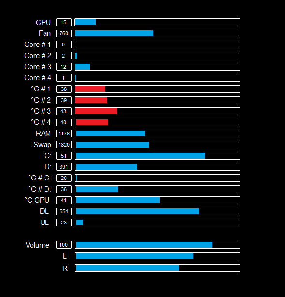
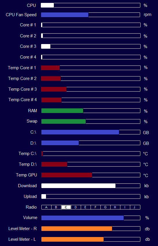
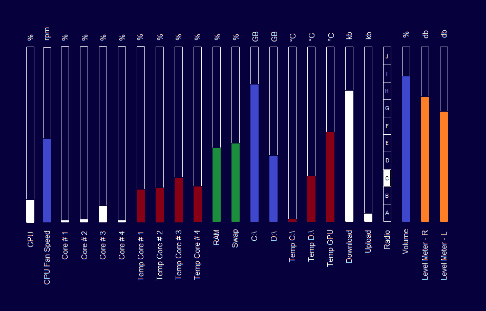
Concept 1 - Pocket Peak
I find the idea of the uniformity of so many bars appealing.
By the way, do you think a skin could get the readings for temperatures from Everest which is installed on my system anyway?
Still missing are the actual values within each of the bars. User should be able to select color, refresh rate and transparency.
I could imagine to add even more bars for airpressure, local temperature, week day (Mon to Sun or 1 to 7), day of the month (1 to 31), month of the year (Jan to Dec or 1 to 12), hours of the day (1 to 24), minutes of an hour (1 to 60), seconds of a minute (1 to 60), system fan speed, customized bars that show used and remaining sizes of each folder for music, documents, videos, programs and pictures.
A mouse click on a bar would open an explorer window with the matching location.
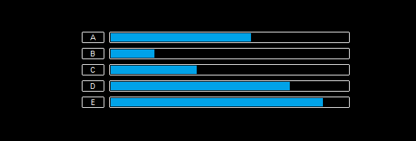
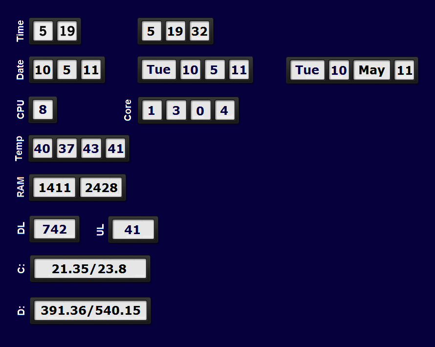
Concept 2 - Spin
I have been inspired for this skin by an existing clock called Reloj.
I would like the clock to show 24h instead 12h, and if possible, I like the change of numbers to be animated the way, as if wheels spinning downwards to increase and upwards to decrease the numbers. Not sure yet whether multiple numbers should be separated into single digits or not.
I'm not really happy with location nor size of the labels for both concepts. On concepts 1 (Pocket Peak) I'd like to put the labels together with the values (percentages, sizes or degrees) within the bars. Problem might be, to make it as easy to read as possible.
On concept 2 (Spin) I'm still not sure yet, but I could imagine the labels to be placed in smaller letters, aligned on either side of the gauges.
Why didn't you leave a comment ?


 Quote
Quote