Icons that MS forgot to change?

Page 2 of 2 FirstFirst 12

  1. Posts : 4,364
    Windows 11 21H2 Current build
       #11

    Cam said:
    There are a lot of things MS forgot to change or tweak in Windows 7 in terms of aesthetics.

    1. The Registry Editor Icon.
    http://img263.imageshack.us/img263/6681/regediticon.png
    This is a given. It hasn't been changed since Windows 95, and that's pathetic.

    2. The Taskbar/Start Menu Icon.
    http://img197.imageshack.us/img197/3...rtmenuicon.png
    Minor, but still, it's kind of weird that MS left it in. The icon is clearly brought over from Vista, so the image of the taskbar isn't of Windows 7's.

    3. Computer/Monitor Icon.
    http://img263.imageshack.us/img263/9...mputericon.png
    Really minor, but it doesn't really "fit" with the rest of W7. Perhaps the icon could use a light grey + light blue color palette just like the rest of the icons?

    4. "The Bar".
    http://img263.imageshack.us/img263/4050/bar.png
    The bar that has the "File, Edit, View", etc on it. I find it just weird-looking. Perhaps it could simply be changed to a light blue, to match the rest of the menus?

    5. The Screensaver Monitor Icon.
    http://img259.imageshack.us/img259/7488/screensaver.png
    This has been annoying me since Vista. Why can't MS make an icon of a monitor that's relevant to today's standards? Fullscreen (Non-Widescreen) CRT monitors aren't popular anymore.

    6. The Itty-Bitty "About" Icon.
    http://img362.imageshack.us/img362/7421/aboutitunes.png
    MS also hasn't changed this one since the days of Windows 95.

    Post your own suggestions/notices!
    Registry icon - It's one that has become universal with Windows, as you yourself noted. I say make it look pretty but keep the icon.

    Title bar - you'd prefer Office 2007's Ribbon?

    Orbital Shark said:
    I wouldn't go so far as to say they've been ignored. Maybe MS see no reason to change them

    I would agree that if you create a new OS then you should at least change ALL aspects of it
    I don't see the need for a new OS to use nwe icons - not in terms of the icon itself. Now, the rendering / type / scalability / polish of it, yeah, but not hte icon itself.

    Falchion said:
    Good thing we can change them on our own :P
    Amen!

    Hybrid said:
    I don't think they forgot. They just didn't decide to change them :/
    +1

    greenlink23 said:
    if you take a look around your system32 folder you'll find lots of old icons.

    for example:
    the win95 install icon


    or how about the icon for script files
    Correct - three are a lot more icons that have not changed than we realize. For example, the default icon for audio output is a speaker in a box - I change it to the regular speaker icon (speaker by itself) every time. I also change the icon for my USB Communications device (i.e. GE 2 in 1 Skype phone) to an telephone handset...I change the default icons of my AIO card reader drives to reflect which card can be used in each drive....

    So many customizations...so little time....
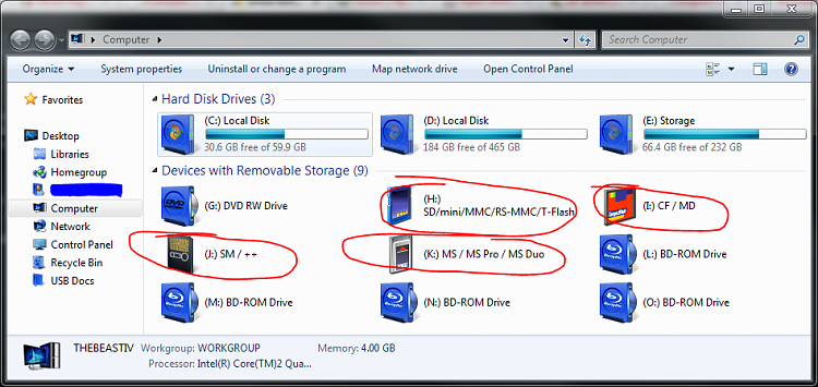
    Icons that MS forgot to change?-aio-card-reader-icons.png
      My Computer


  2. Posts : 43
    Windows 7 7600
       #12

    Here are lots of old icons: c:\Windows\system32\moricons.dll
      My Computer


Page 2 of 2 FirstFirst 12

  Related Discussions
Our Sites
Site Links
About Us
Windows 7 Forums is an independent web site and has not been authorized, sponsored, or otherwise approved by Microsoft Corporation. "Windows 7" and related materials are trademarks of Microsoft Corp.

© Designer Media Ltd
All times are GMT -5. The time now is 18:07.
Find Us